Overview
UI Tweaks is a mod for Vintage Story that enhances the user interface by adding various quality-of-life features and visual improvements. The mod aims to provide a more intuitive and customizable UI experience for players, making it easier to navigate and interact with the game.
A note on development
UI Tweaks is AI-assisted. Some of the code in this mod was written with the help of AI tools — but this is not a “vibe-coded” project. Design, architecture, and testing are handled by a human, and a meaningful share of the code is hand-written as well; AI is used to execute well-defined coding tasks under direction. Every change is reviewed and verified before it lands in the codebase, and nothing reaches a release unless it meets the quality bar set for how the mod should look, feel, and behave in your game. If something falls short of that, please report it.
Installation
Install UI Tweaks from the official mod repository: UI Tweaks on ModDB.
Download the latest .zip from the GitHub releases page and place it in your Mods folder.
Make sure to check out the Features section to see all the cool things UI Tweaks has to offer!
Compatibility
| Status | Mod | Notes |
|---|---|---|
| 🟢 | Status Hud Continued | Compatible. |
| 🟢 | Calendar: Shire-reckoning | Compatible. Month names are replaced correctly. The word “Year” in Environment Widget can be changed by editing it’s config. |
| 🟡 | Hydrate or Diedrate | Displaying thirst tooltips is not supported yet. Satiety-related tooltips should be repositioned in config to accommodate the thirst bar. |
Features
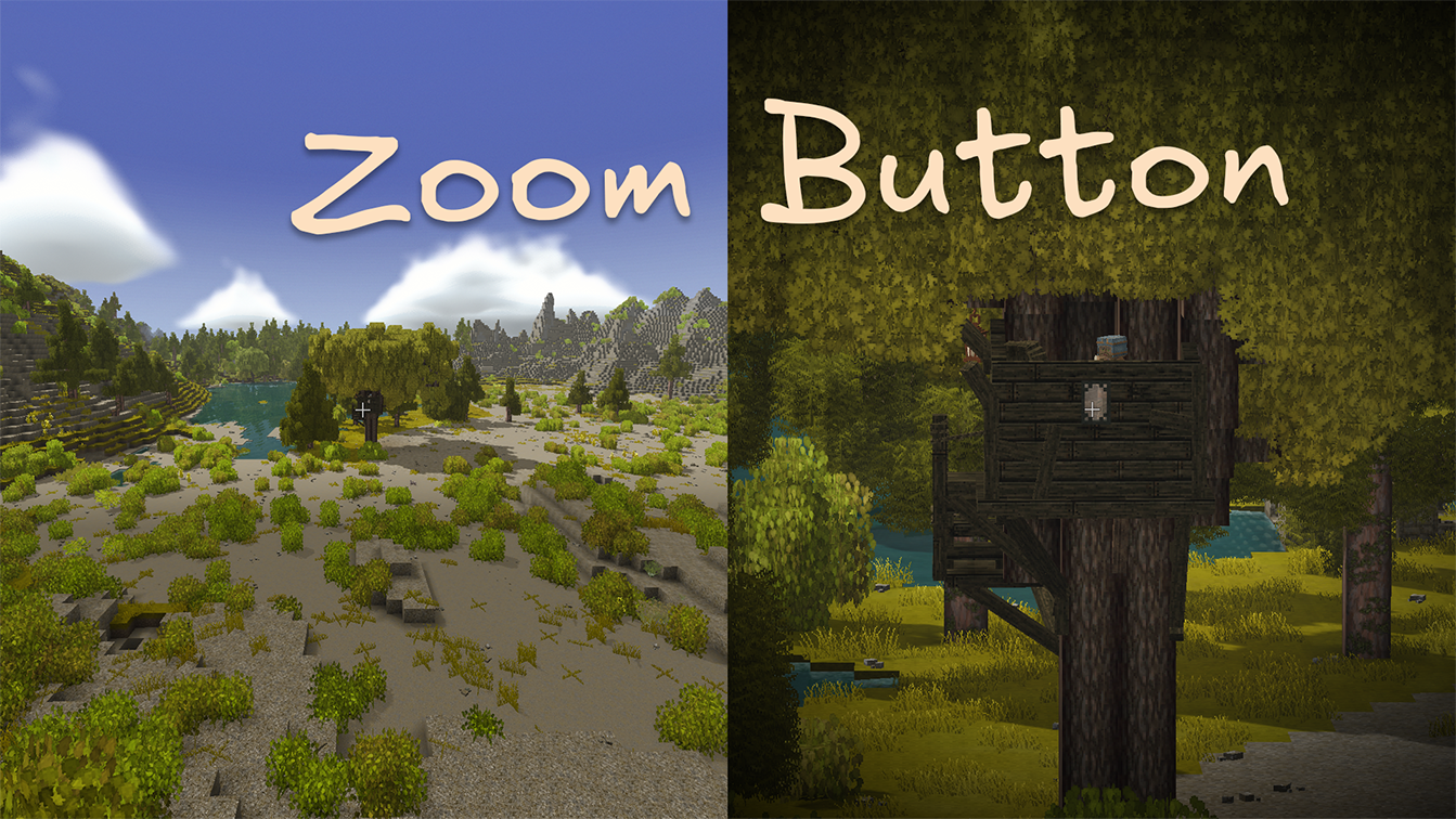
Zoom
Zoom adds a hold-to-zoom camera hotkey for checking distant blocks, animals, ruins, and all the other things that might be either treasure or trouble.
Enable Zoom in the in-game config dialog, restart the game, then hold Z to zoom in. The effect eases in and out and can add a subtle vignette around the screen.
Configurable options:
- Zoom strength: How far the camera zooms in.
- Zoom speed: How quickly the camera zooms in and out.
- Vignette strength: How strong the edge-darkening effect is. Set it to
0to turn the vignette off.

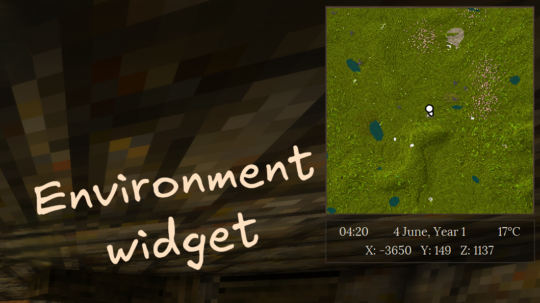
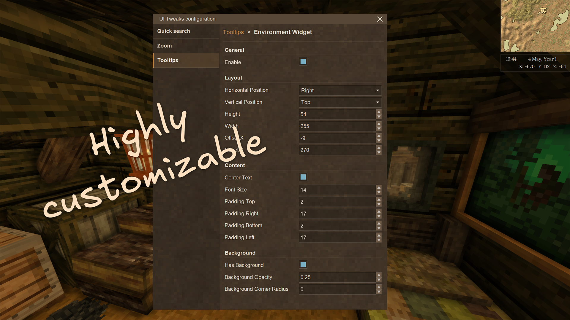
Environment Widget
The Environment Widget is a HUD overlay that displays useful world and player information at a glance:
- Date & time — current in-game date and time
- Temperature — ambient temperature at the player’s position
- Coordinates — player’s X, Y, Z position in the world
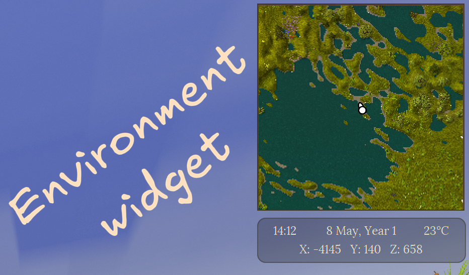
The widget is positioned in the top-right corner by default and can be fully customized: position, size, text format, and background opacity are all configurable.
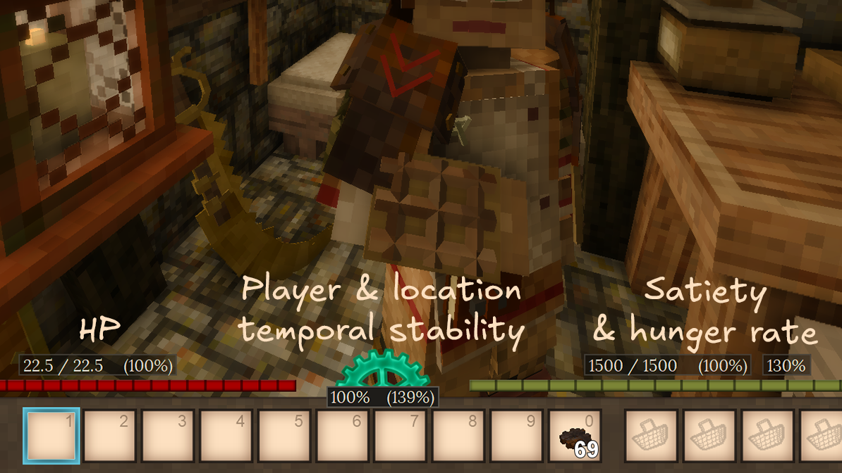
Status Tooltips
💡 Inspired by Extended HUD info.
Customize your HUD by enabling additional elements provided by UI Tweaks:
- HP: Displays current / maximum HP as a number or a percentage above the health bar.
- Satiety: Displays current / maximum satiety as a number or a percentage above the satiety bar.
- Hunger rate: Displays the player’s current hunger rate.
- Temporal stability: Displays the player’s temporal stability, as well as temporal stability at player’s current position.

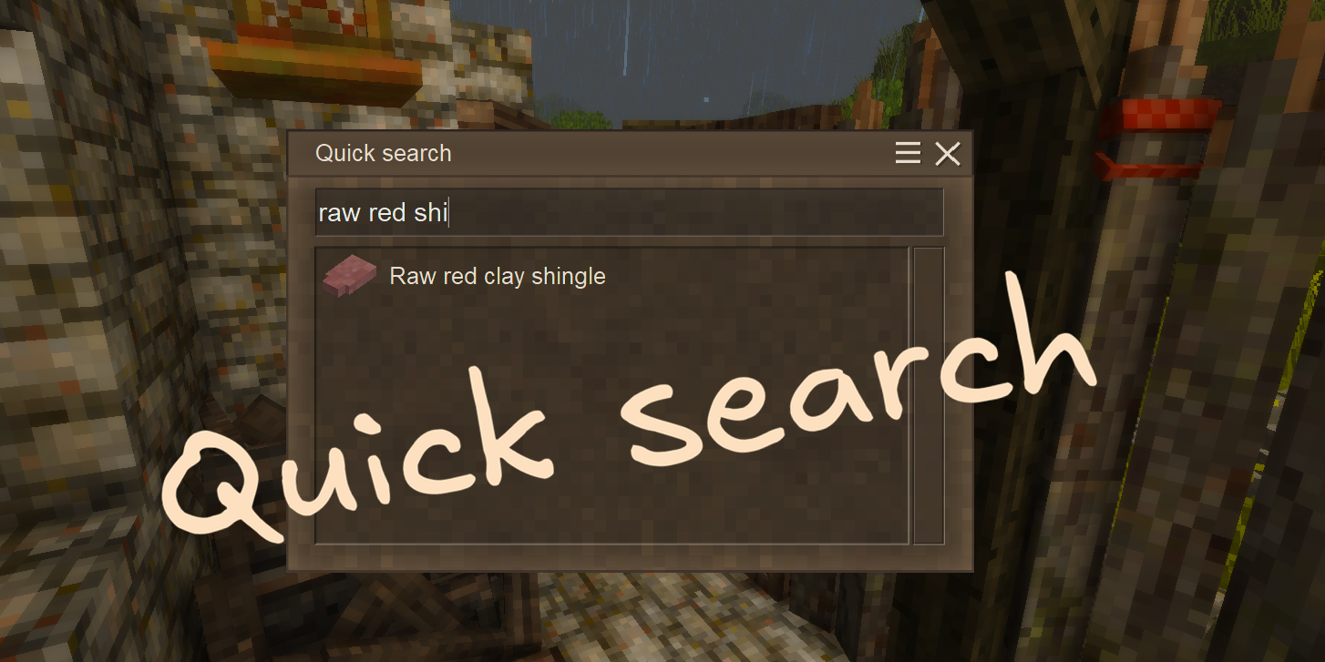
Quick Search
💡 Inspired by Satisfactory’s quick search feature.
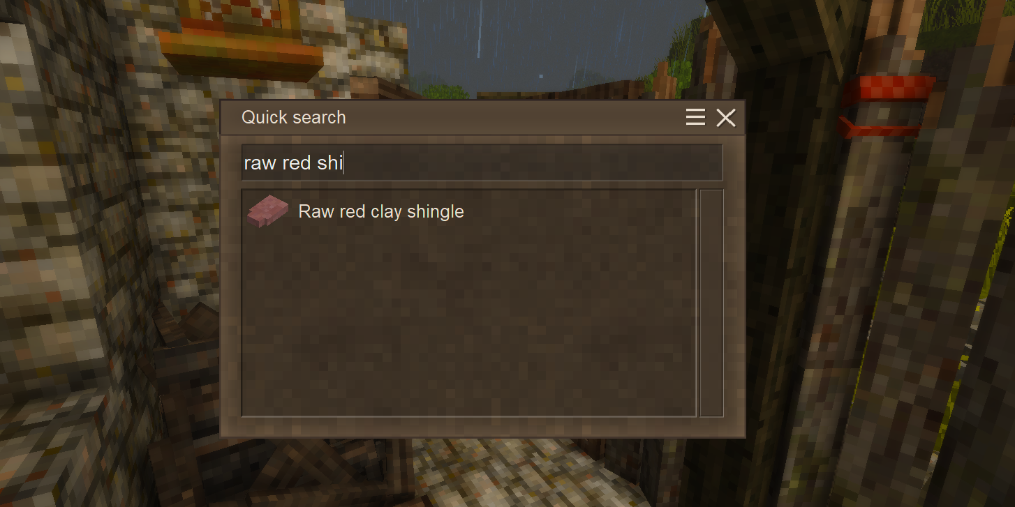
QuickSearch allows quickly searching for handbook entries by name. Simply press the configured hotkey (default: N) and start typing the name of the entry you want to find.
This search behaves differently from the vanilla handbook search. We hope you find it intuitive and easy to use. Try it out and let us know what you think!
Also check out the Calculator feature below, which allows Quick Search to double as a simple calculator.
We think Quick Search may benefit from the following features in the future:
- Search filters
- Search guide entries
- Search by description
- Search by item tags
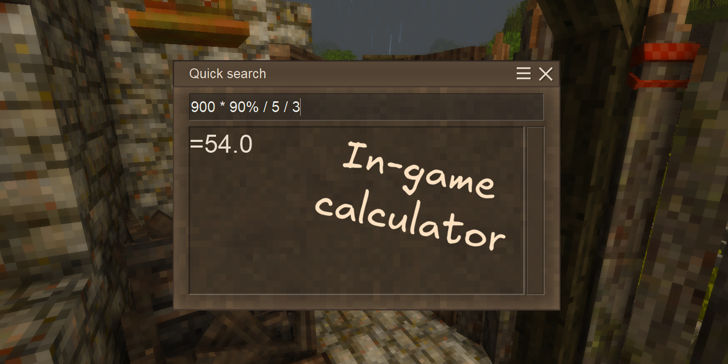
Calculator
QuickSearch also allows calculating mathematical expressions right in the search box, just like in Satisfactory!
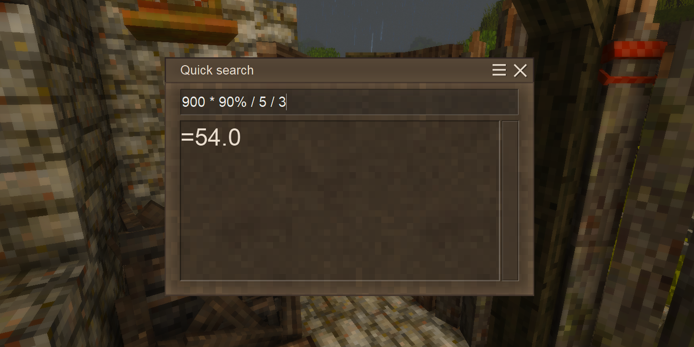
Supported operations:
- Addition:
+ - Subtraction:
- - Multiplication:
* - Division:
/ - Percentages:
% - Parentheses:
() - More operations may be added in the future!
Minor Tweaks
Small quality-of-life corrections applied to the vanilla game.
Calendar year — years now start at 1 instead of 0.
Request a Feature
If you have an idea for a feature you’d like to see in UI Tweaks, please let us know! You can submit a feature request as an issue on our GitHub repository or reach out to us on our Discord server. We welcome all suggestions and will do our best to consider them for future updates!
Configuration
Mod configuration
You can configure UI Tweaks directly in-game by pressing Shift + N (default).
Alternatively, you can edit the ui-tweaks.json file in your Vintage Story’s ModConfig folder manually.
Keep in mind that changing some of these options may require you to restart the game or reload the world for the changes to take effect.
Note: You need to start a game with this mod installed at least once for it to generate the default configuration file.
Configuration values
hud — Configuration for the heads-up display (HUD) features of the mod.
environmentWidget — Configuration for the environment widget.
-
enable: Whether to show the environment widget. Default:false. -
dialogArea: The dialog area anchor for the widget. Default:RightTop. -
height: Height of the widget in pixels. Default:54.0. -
width: Width of the widget in pixels. Default:255.0. -
centerText: Whether to center the widget text. Default:true. -
offset: Offset of the widget from its default position.
-
x: Horizontal offset. Default:-9.0. -
y: Vertical offset. Default:270.0.
padding: Padding of the widget content.
-
top: Top padding. Default:2.0. -
right: Right padding. Default:17.0. -
bottom: Bottom padding. Default:2.0. -
left: Left padding. Default:17.0.
-
drawOrder: Rendering order of the widget. Default:0.1. -
hasBackground: Whether to show a background behind the widget. Default:true. -
backgroundOpacity: Opacity of the background. Default:0.25. -
backgroundCornerRadius: Corner radius of the background. Default:0.0. -
format: Format of the widget text. Supports VTML and variable placeholders. Default:<font align=left>{world-date-time:HH:mm}</font><font align=right>{player-location-temperature-celsius}°C</font><br>X: {player-location-coordinates-x} Y: {player-location-coordinates-y} Z: {player-location-coordinates-z}. -
extraElements: Additional lines of text to display in the widget. Supports the same format asformat. Default:["{world-date-time:d MMMM, Year y}"]. -
fontSize: Font size of the widget text in pixels. Default:14.0.
healthbarTooltip — Configuration for the health bar tooltip.
-
enable: Whether to show the healthbar tooltip. Default:false. -
dialogArea: The dialog area anchor for the tooltip. Default:CenterBottom. -
height: Height of the tooltip in pixels. Default:20.0. -
width: Width of the tooltip in pixels. Default:140.0. -
centerText: Whether to center the tooltip text. Default:false. -
offset: Offset of the tooltip from its default position.
-
x: Horizontal offset. Default:-250.0. -
y: Vertical offset. Default:-88.0.
padding: Padding of the tooltip content.
-
top: Top padding. Default:-2.0. -
right: Right padding. Default:4.0. -
bottom: Bottom padding. Default:0.0. -
left: Left padding. Default:4.0.
-
drawOrder: Rendering order of the tooltip. Default:0.1. -
hasBackground: Whether to show a background behind the tooltip. Default:true. -
backgroundOpacity: Opacity of the background. Default:0.5. -
backgroundCornerRadius: Corner radius of the background. Default:0.0. -
format: Format of the tooltip text. Supports VTML and variable placeholders. Default:<font align=left>{player-health-current} / {player-health-max}</font><font align=right>({player-health-percent}%)</font>. -
extraElements: A collection of additional text strings displayed together with the main content. Each element follows the same format asformat. This property is optional and omitted by default — you can add it manually if needed. -
fontSize: Font size of the tooltip text in pixels. Default:14.0.
satietyTooltip — Configuration for the satiety tooltip.
-
enable: Whether to show the satiety tooltip. Default:false. -
dialogArea: The dialog area anchor for the tooltip. Default:CenterBottom. -
height: Height of the tooltip in pixels. Default:20.0. -
width: Width of the tooltip in pixels. Default:148.0. -
centerText: Whether to center the tooltip text. Default:false. -
offset: Offset of the tooltip from its default position.
-
x: Horizontal offset. Default:250.0. -
y: Vertical offset. Default:-88.0.
padding: Padding of the tooltip content.
-
top: Top padding. Default:-2.0. -
right: Right padding. Default:4.0. -
bottom: Bottom padding. Default:0.0. -
left: Left padding. Default:4.0.
-
drawOrder: Rendering order of the tooltip. Default:0.1. -
hasBackground: Whether to show a background behind the tooltip. Default:true. -
backgroundOpacity: Opacity of the background. Default:0.5. -
backgroundCornerRadius: Corner radius of the background. Default:0.0. -
format: Format of the tooltip text. Supports VTML and variable placeholders. Default:<font align=left>{player-satiety-current} / {player-satiety-max}</font><font align=right>({player-satiety-percent}%)</font>. -
extraElements: A collection of additional text strings displayed together with the main content. Each string follows the same format asformat. This property is optional and omitted by default — you can add it manually if needed. -
fontSize: Font size of the tooltip text in pixels. Default:14.0.
hungerTooltip — Configuration for the hunger rate tooltip. Disabled by default.
-
enable: Whether to show the hunger tooltip. Default:false. -
dialogArea: The dialog area anchor for the tooltip. Default:CenterBottom. -
height: Height of the tooltip in pixels. Default:20.0. -
width: Width of the tooltip in pixels. Default:44.0. -
centerText: Whether to center the tooltip text. Default:true. -
offset: Offset of the tooltip from its default position.
-
x: Horizontal offset. Default:354.0. -
y: Vertical offset. Default:-88.0.
padding: Padding of the tooltip content.
-
top: Top padding. Default:-2.0. -
right: Right padding. Default:0.0. -
bottom: Bottom padding. Default:0.0. -
left: Left padding. Default:0.0.
-
drawOrder: Rendering order of the tooltip. Default:0.1. -
hasBackground: Whether to show a background behind the tooltip. Default:true. -
backgroundOpacity: Opacity of the background. Default:0.5. -
backgroundCornerRadius: Corner radius of the background. Default:0.0. -
format: Format of the tooltip text. Supports VTML and variable placeholders. Default:{player-satiety-hunger}%. -
extraElements: A collection of additional text strings displayed together with the main content. Each string follows the same format asformat. This property is optional and omitted by default — you can add it manually if needed. -
fontSize: Font size of the tooltip text in pixels. Default:14.0.
temporalStabilityTooltip — Configuration for the temporal stability tooltip. Disabled by default.
-
enable: Whether to show the temporal stability tooltip. Default:false. -
dialogArea: The dialog area anchor for the tooltip. Default:CenterBottom. -
height: Height of the tooltip in pixels. Default:20.0. -
width: Width of the tooltip in pixels. Default:100.0. -
centerText: Whether to center the tooltip text. Default:false. -
offset: Offset of the tooltip from its default position.
-
x: Horizontal offset. Default:0.0. -
y: Vertical offset. Default:-60.0.
padding: Padding of the tooltip content.
-
top: Top padding. Default:-2.0. -
right: Right padding. Default:4.0. -
bottom: Bottom padding. Default:0.0. -
left: Left padding. Default:4.0.
-
drawOrder: Rendering order of the tooltip. Default:0.11. -
hasBackground: Whether to show a background behind the tooltip. Default:true. -
backgroundOpacity: Opacity of the background. Default:1.0. -
backgroundCornerRadius: Corner radius of the background. Default:0.0. -
format: Format of the tooltip text. Supports VTML and variable placeholders. Default:<font align=left>{player-temporal-stability}%</font><font align=right>({player-location-temporal-stability}%)</font>. -
extraElements: A collection of additional text strings displayed together with the main content. Each string follows the same format asformat. This property is optional and omitted by default — you can add it manually if needed. -
fontSize: Font size of the tooltip text in pixels. Default:14.0.
exampleCustomTooltip - Example custom tooltip configuration.
This object is written to the configuration file as a template. It is never displayed, even when its enable property is set to true. Copy it into customTooltips to create a working custom tooltip.
customTooltips — An array of custom tooltip configurations.
name: Internal name of the custom tooltip. Default:my-custom-tooltip.
Each entry also supports the same properties as the built-in tooltips above. Default: [].
quickSearch — Configuration for the quick search feature.
-
enable: Whether to enable the quick search feature. Default:false. Requires a game restart. -
resultListHeight: The height of the quick search result list in pixels. Valid range in the in-game config dialog:50to600, in steps of10. Default:200.
tweaks - Configuration for minor game tweaks.
correctCalendarYear: Whether displayed calendar years start at1instead of0. Default:true.
zoom - Configuration for the zoom hotkey feature.
-
enable: Whether to register the zoom hotkey. Default:false. Requires a game restart. -
strength: How far the camera zooms in. Valid range:1to10. Default:2. -
speed: How quickly the camera zooms in and out. Valid range:1to10. Default:2. -
vignetteStrength: Strength of the vignette while zooming. Valid range:0to10. Default:5. Set to0to disable the vignette.
Variable placeholders
These placeholders can be used in any tooltip format string.
Placeholders also support .NET format strings, specified after a colon (e.g.
{world-date-time:HH:mm}).
Player Status
Health
-
{player-health-current}- Player’s current health. -
{player-health-max}- Player’s maximum health. -
{player-health-percent}- Player’s current health as a percentage of maximum health.
Satiety
-
{player-satiety-current}- Player’s current satiety. -
{player-satiety-max}- Player’s maximum satiety. -
{player-satiety-percent}- Player’s current satiety as a percentage of maximum satiety. -
{player-satiety-hunger}- Player’s current hunger rate.
Temporal stability
{player-temporal-stability}- Player’s current temporal stability level.
Player Location
-
{player-location-coordinates}- Player’s current coordinates (X, Y, Z). -
{player-location-coordinates-x}- Player’s current X coordinate. -
{player-location-coordinates-y}- Player’s current Y coordinate. -
{player-location-coordinates-z}- Player’s current Z coordinate.
Temperature
-
{player-location-temperature-celsius}- Current temperature at the player’s location in Celsius. -
{player-location-temperature-fahrenheit}- Current temperature at the player’s location in Fahrenheit.
Average conditions
-
{player-location-average-yearly-temperature-celsius}- Average yearly temperature at the player’s location in Celsius. -
{player-location-average-yearly-temperature-fahrenheit}- Average yearly temperature at the player’s location in Fahrenheit. -
{player-location-average-precipitation-percent}- Average precipitation at the player’s location. -
{player-location-average-forestation-percent}- Average forestation at the player’s location. -
{player-location-average-shrubbery-percent}- Average shrubbery at the player’s location.
Temporal stability
{player-location-temporal-stability}- Temporal stability at the player’s location.
World Status
Current time
{world-date-time}- Current in-game world date and time.
Contributing
Contributing
Thank you for your interest in contributing to UI Tweaks! We welcome contributions of all kinds, including bug fixes, new features, documentation improvements, and more. Here are some guidelines to help you get started:
- Fork the repository: Click the “Fork” button at the top right of the repository page to create your own copy of the project.
- Create a new branch: It’s best to create a new branch for your changes. This keeps your work separate from the main codebase and makes it easier to manage pull requests.
- Make your changes: Implement your changes in your branch. Be sure to follow the existing code style and conventions.
- Test your changes: Make sure to test your changes thoroughly to ensure they work as expected and do not introduce new issues.
- Commit your changes: Write clear and concise commit messages that describe the changes you made.
- Push your changes: Push your branch to your forked repository on GitHub.
- Create a pull request: Go to the original repository and click the “New pull request” button. Select your branch and provide a clear description of your changes and why they are needed.
- Respond to feedback: The maintainers may provide feedback or request changes to your pull request. Please be responsive and willing to make adjustments as needed.
- Celebrate your contribution: Once your pull request is merged, congratulations! You’ve contributed to the project and helped make it better for everyone. Your name should also appear in the contributors list on the GitHub repository.
We also encourage you to check out our issues page for any open issues or feature requests that you might be interested in working on.
Tips for contributing
- Start small: If you’re new to contributing, consider starting with small bug fixes or documentation improvements to get familiar with the process.
- Communicate: If you’re unsure about how to implement a feature or fix a bug, don’t hesitate to ask for help in the issues or discussions sections.
- Be respectful: Remember that open source is a collaborative effort. Be respectful and considerate in your interactions with other contributors and maintainers.
- Have fun: Contributing to open source can be a rewarding experience. Enjoy the process and the opportunity to learn and grow as a developer!
Additional resources
- BitzArt-VS Discord server - Join our community to discuss UI Tweaks, ask questions, and get help with your contributions.
- Vintage Story modding: Getting Started - A guide on how to get started with modding Vintage Story from the official wiki.
- GitHub’s guide to contributing - A comprehensive guide on how to contribute to projects on GitHub.